CSS おれおれ Advent Calendar 2012 – 21日目
セフセフ。
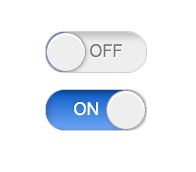
iOSの選択ボタン。HTMLでいうチェックボタン的なもの。”Switch Control”というらしいです。
HTML
こんな感じです。
<p>
    <label class="switch">
        <input type="checkbox" />
        <span class="label">
            <span class="on">ON</span
            ><span class="separator"></span
            ><span class="off">OFF</span>
        </span>
    </label>
</p>
ちょいと余分な空白が出るのが嫌だったので、
            <span class="on">ON</span>
            <span class="separator"></span>
            <span class="off">OFF</span>
ではなく
            <span class="on">ON</span
            ><span class="separator"></span
            ><span class="off">OFF</span>
としました。
あとspan.separatorは素直に画像の方が良いかも。
ラジオボタンは非表示に
display:noneで隠しておきます。
非表示でも<label />は反応してチェックを切り替えてくれます。
角丸とONとOFFの間の丸ポチ
label.switchにborder-radiusとoverflow:hiddenを指定します。後で内側の要素だけ動かして表示を切り替える想定。
.switch {
  border: solid 1px #ccc;
  display: inline-block;
  height: 40px;
  width: 100px;

  /* 角丸 */
  border-radius: 20px;
  overflow: hidden;
}
丸ポチはborder-radiusをいっぱいにかけて、丸にします。適当に影も付けておきます。
ONとOFF
サイズを固定にしておきます。
あとはグラデーションなど適当に。
.switch .on,
.switch .off {
  display: inline-block;
  height: 40px;
  line-height: 40px;
  text-align: center;
  width: 80px;
}
.switch .on {
  background-color: #00f;
  background-image: linear-gradient(
    top,
    hsl(214,90%,40%),
    hsl(214,90%,70%)
    );
  box-shadow:
    3px 2px 10px rgba(0,0,0,.2) inset,
    -3px 2px 10px rgba(0,0,0,.2) inset;
  color: #fff;
  text-shadow: -1px -1px rgba(0,0,0,.3);

}
.switch .off {
  background-color: #eee;
  box-shadow: 5px 5px 10px rgba(0,0,0,.2) inset;
  color: #777;
  text-shadow: 1px 1px #fff;
}
チェックが付いたら表示切替
iOS風選択ボタンのときと同じく、直接隣接結合子+を使います。<input type="checkbox" />が:checkedになったら、その直後に出現する<span />の表示を変更します。
.switch .label {
  margin-left: -60px;
}
.switch :checked + .label {
  margin-left: 0;
}
外側.switchはONとOFFの片方(と丸ポチ)分の幅しかありません。そこにoverflow:hiddenを指定しているので、一度に見えるのは片方です。
そこで内側.labelの位置を調節する事で、見えるものを変更する事が出来ます。
チェック時にアニメーション
transitionです。
.switch .label {
  transition: margin .1s;
}
marginの値に変更があった場合、一瞬ではなく0.1sかけて変更します。
わーいできたよー
細かいところは実際のコードを見てください。また諸々ベンダープレフィックスが必要だったりします。